Regression#
Important Readings
[FPP07], Chapters 10, 11, 12
Regression Line#
Suppose we wanted to predict a variable \(y\). We could just guess the average \(y\) value. This can be improved upon by incorporating information from a related variable \(x\). The regression line does that. It is the trend line through a scatter diagram of \(x\) vs \(y\). The line estimates the average value of \(y\) corresponding to each possible \(x\). We sometimes call this simple linear regression to emphasize that we are predicting \(y\) from a single variable \(x\). Though not in our textbook, the notation \(\hat{y}\) (read as “y hat”) is often used for the predicted \(y\) value.
Use the interactive graph below, dragging the points around, to see how the regression line fits the data.
The Slope#
Conceptually, the regression line is distinct from a correlation coefficient because the slope conveys an effect size. If the slope is 2, we are saying that increasing \(x\) by 1 unit predicts a 2-unit increase in \(y\).
The slope is directly related to the correlation coefficient, \(r\). For each SD increase in \(x\), there is an average increase of \(r\) SDs in \(y\). The regression slope converts this from standard units back into natural units,

Fig. 29 The regression slope and \(r\) are the same if the data is in standard units.#
Example Suppose, for a collection of foods, the correlation between protein and calories per 100 grams is \(r = 0.4\). A particular food is 2 SDs above the average in calories. Predict how many SDs above average it is in protein per 100 grams.
Protein
The food will be \(2 \times r = 0.8\) SDs above the average in protein.
Example Suppose, for a collection of foods, the correlation between protein and calories per 100 grams is \(r = 0.4\). The average food has 180 calories and 12 grams of protein. The SDs are 60 and 4 for calories and protein, respectively. A particular food has 60 calories. Predict how many grams of protein it has.
Calories
The food is two SDs below the average in calories. It will be \(2\times r = 0.8\) SDs below average in protein. The prediction is \(12 - (.8\times 4) = 8.8\) grams of protein.
Linearity#
Any trustworthy regression is built on the assumption that \(x\) and \(y\) are linearly related. Which of these scenario are suited to regression analysis predicting wage in dollars from job tenure in months at a factory?
All employees are first hired at a wage of $20 per hour. Then at, at six months intervals, everyone receives a raise which averages $1 per hour.
All employees are first hired at a wage of $20 per hour. Then at, at six months intervals, everyone receives a raise which averages an additional 10% per hour.
All employees are first hired at a wage of $20 per hour. Everyone receives an average $1 per hour raise after their two years. The next raise is also $1 per hour, but it arrives after the next year. The next raise is also $1 per hour, but it arrives after the next six months…
Linearity
Only the first example could be interpreted as a linear relationship between tenure and wage.
Finding the Regression Line#
The regression line is given by an equation \(\hat{y} = mx + b\). The slope is \(m\). The intercept, \(b\), can be interpreted as the predicted value of \(y\) if \(x=0\). The intercept is found by realizing that an average \(x\) value predicts an average \(y\) value. Armed with a slope and a point on the line, finding the intercept is a matter of algebra.

Fig. 30 The best fit is found when the regression line passes throught the point of averages.#
The general recipe to find the line is:
The slope is \(m = r \times \frac{\text{SD}_y}{\text{SD}_x}.\)
Now find \(b\), the intercept.
The point (\(\text{Average}_x, \text{Average}_y\)) is on the line.
Plug that into \(y = r \frac{\text{SD}_y}{\text{SD}_x} x + b\).
Solve, \(b = \text{Average}_y - r \frac{\text{SD}_y}{\text{SD}_x} \text{Average}_x \).
The regression line is then \(\hat{y} = mx + b.\)
Residuals (Errors)#
The regression line provides an average prediction. For any data point, there is a prediction error (also called a residual). This is calculated
Here, the order matters. Positive prediction errors correspond to underestimations. Negative prediction errors arise when the predicted value is higher than the actual value. Above and below the regression line, we find positive and negative errors, respectively.
Below, we are predicting protein content from calories. The prediction line happens to separate animal protein sources from mostly vegan foods.
Outliers#
Outliers are not emphasized in [FPP07], but you might already apply the term to any data point that singly defies the trend in the rest of the data. In the data above, you might argue that the Little Debbie Nutty Buddy is an outlier. The slope would be greater and the regression line would better fit the data if we could drop the Nutty Buddy.
Should you drop the Nutty Buddy observation? We can live with “maybe.” It will eventually come down to whether or not Nutty Buddies are relevant for your purposes. If you care only about the relationship between calories and protein in unprocessed foods, it is prudent to drop the Nutty Buddy. If you care about the diet of someone who knows and enjoys such gustatory treasures, include the Nutty Buddy. If want to study a standard American diet, you should really add more proccessed foods to the data.
Evaluating the Regression Line#
A regression performs well if the predictions are accurate. This is a property of the residuals. If residuals are typically close to zero, then the regression is good. We can’t look at the average residual-the average residual will always be zero (for the residuals calculated from the data used to find the regression line). This is no different than how we had to summarize deviations from an average when covering standard deviation. Similarly, we turn to a root mean square calculation.
We summarize the typical residual by calculating the root mean square error (rms error or RMSE). This is the root mean square size of a list, applied to the list of residuals.
It turns out, this is equal to \(\sqrt{1-r^2} \times \text{SD}_y\). Why does it make more sense that \(\text{SD}_y\) appears in the formula instead of \(\text{SD}_x?\)
root mean square error
Units. Residuals are vertical distances, measured in \(y\) units.
Notice, because rms error = \(\sqrt{1-r^2} \times \text{SD}_y\), then the rms error is less than or equal to \(\text{SD}_y\). In words, we can better predict \(y\) using \(x\) and \(y\) than by using \(y\) alone (constructing a regression line or an average, respectively).
The residual plot#
A residual plot is constructed as a scatter diagram of the \(x\) values and the residual. The specific pairs are \((x, y - \hat{y})\). If the residual plot shows a trend, like increasing spread or something nonlinear, that’s a sign a linear regression might not work well.

Fig. 31 The diagram on the left related \(x\) and \(y\). The residual plot on the right shows no systematic pattern between \(x\) and the residuals.#
The residual plot should be a formless cloud like in Fig. 31. This is a residual plot showing equal variance in the residuals or homoscedasticity. This means the residuals have a similar kind of distribution for any narrow interval on the \(x\)-axis. While we do see less range on the extremes above, that is just because there are fewer data points at the extremes. In this case, the root mean square error describes the typical residual for any region on the \(x\)-axis. And, similar to SD, the 68-95 often applies to football-shaped scatter diagrams. About 68% of the data will be within one rms error of the regression line and 95% will be within two rms errors.
If homoscedasticity is violated, and the residual plot shows some systematic pattern, then we say the residual plot demonstrates heteroscedasticity. Heteroscedasticity arises naturally when something becomes more or less predictable as the independent variable increases. Fig. 32 shows the example of predicting sleeplessness from the amount of sleep someone got in a day. If someone slept the entire day, it is easy to predict that they experienced no sleeplessness. However, at low levels of sleep, it’s hard to know if that’s because the person was tossing and turning or just raving.

Fig. 32 It’s easy to predict sleeplessness if you sleep all day.#
Regression Fallacy#
In the next few chapters, we will develop an appreciation for randomness and chance processes. To whet your appetite, we revisit the idea of regression to mediocrity. Suppose we understood basketball performance for a single game to be determined by ability and some noise captured in a chance error, as described by the equation below.
When we write this down, we are theorizing this as a description of how the universe works, as if we discovered a gravitational constant or \(E=mc^2\). The chance error stands in for things that are actually random–maybe some NBA players are just consistently lucky–or things that are unobserved by statisticians like yourself and thus random from your perspective if not instrinsically. Though it’s not exactly realistic, let’s suppose we have some all-encompassing measure of basketball ability, and the chance error is all random luck.
Luck will mean that some percentage of players will outperform their abilities, some will underperform, but most will perform close to their abilities. By the time the next game rolls around, everyone’s luck is reset, with an equal chance of good luck, bad luck, or neutral luck.
Player |
Ability |
Luck 1 |
Performance 1 |
Luck 2 |
Performance 2 |
|---|---|---|---|---|---|
Player 1 |
4 |
-1 |
3 |
-1 |
3 |
Player 2 |
4 |
-1 |
3 |
0 |
4 |
Player 3 |
4 |
-1 |
3 |
1 |
5 |
Player 4 |
4 |
0 |
4 |
-1 |
3 |
Player 5 |
4 |
0 |
4 |
0 |
4 |
Player 6 |
4 |
0 |
4 |
1 |
5 |
Player 7 |
4 |
1 |
5 |
-1 |
3 |
Player 8 |
4 |
1 |
5 |
0 |
4 |
Player 9 |
4 |
1 |
5 |
1 |
5 |
All players have equal ability, so the “bad” players in Table 10 are those who drew bad luck in game one. On average, they outperform their first game in their second. Similarly, the “good” players underperform in their second game. At the scale of season to season instead of game to game, this can explain the sophomore slump as a straightforward consequence of randomness. The regression fallacy is the misinterpretation of this phenomenon as something other than random luck.
Exercises#
Exercise 24
We want to study assortative mating among couples. Specifically, if partner A makes a lot of money, does partner B also make a lot?
Are you more interested in correlation or a regression slope? Explain your choice.
What would a correctly structured data set look like? What are the variables? Discuss at least one ambiguity related to the construction of \(x\) and \(y\) variables.
Exercise 25
Predicting how much someone spends on expensive fur coats based on their income is easy for low income levels and difficult at high income levels. Imagine you ran a regression predicting spending on fur coats from income. Sketch a plausible residual plot.
Exercise 26
The graph below shows the relationship between height and basketball ability. Suppose a professional basketball player is someone with exceptionally high ability. Why might a professional underestimate the importance of height if they only observe other professional athletes?

Python#
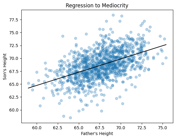
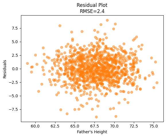
Below is a complete regression analysis in Python.
The scatter plot demonstrates a linear trend between quantitative variables. The residual plot also demonstrates equal variance or homoscedasticity. We can be confident that linear regression is appropriate for this data.
#!pip install --upgrade statwrap
import statwrap
from IPython.display import display, Markdown as md
%use_all

url = 'https://raw.githubusercontent.com/alexanderthclark/Stats1101/main/Data/FatherSonHeights/pearson.csv'
# load a DataFrame
df = pd.read_csv(url)

# Set independent and dependent variables
y = df['Son'] # Son's heights
x = df['Father'] # Father's heights

# Run regression
reg = linest(y, x)

# Show regression line equation in output below
display(md('Regression line:'), reg)

# Plot data and regression line
reg.plot(xlabel = 'Father\'s Height',
         ylabel = "Son's Height",
         title = 'Regression to Mediocrity')

# Find rmse
rmse = reg.rms_error

# Make residual plot
scatter_plot(x, reg.residuals,
            xlabel = "Father's Height",
            ylabel = 'Residuals',
            title = f'Residual Plot\nRMSE={rmse:.1f}',
            color = 'C1')
Regression line: