
The Histogram#
Important Readings
[FPP07], Chapter 3
Summarizing a Distribution#
You’ve probably seen histograms before. They are used to summarize data by showing the distribution. Suppose we collect data on how much television people watch.

Fig. 2 A histogram showing a symmetric, bell-shaped distribution.#
Fig. 2 lacks any vertical scale. This is inessential as long as we’re only concerned with the shape of the data. The shape can be described without any specific jargon, but common terms are bell-shaped, symmetric and skewed. The tails represent the extreme regions. Bell-shaped distributions are common for traits like height. For other things, like fame, you should expect skew. The right tail for the distribution of heights only goes so far, but the right tail for the distribution of fame will be very long, with a few exceptionally famous people. There is no one as tall as Taylor Swift is famous.[1]

Fig. 3 Two skewed histograms. The left panel features on a long left tail and the right panel features a long right tail.#
A histogram is made of blocks (or bars). Each block has a predetermined class interval and thus a width. Given the interval, the height of a block is determined by the data. More specifically, the height is chosen so the area of the block is proportional to the number of data points in the class interval. If a vertical scale is supplied, the areas will sum to 100% (or 1, depending on what software you use). This corresponds to a density scale.
Suppose we observed incomes $0, $10, $10, $20, $20, $20, $30, and $216. This approximates the level of income inequality in South Africa.[2] Table 6 summarizes the data set.
Value |
Count |
Percentage (%) |
|---|---|---|
0 |
1 |
12.5 |
10 |
2 |
25 |
20 |
3 |
37.5 |
30 |
1 |
12.5 |
216 |
1 |
12.5 |
Fig. 4 plots histograms with different class intervals. The top panel is the most natural to draw, with one-unit-wide class intervals. It’s typical to use wider intervals. The other panels increase the widths, thus changing the \(y\)-axis.

Fig. 4 All three histograms show the same data. The blocks have areas 12.5%, 25%, 37.5%, 12.5%, and 12.5% in each histogram.#
The height of a block represents crowding, not an actual percentage. The last block of the bottom panel of Fig. 4, spanning from 35 to 221, is short because there’s just one data point in that wide interval.
Histograms reveal the shape of the distribution, and sometimes interesting irregularities, like in [FPP07] Review Exercise 11 and in the following example.
Example: Sleuthing out Fraud#
[SMG+12], titled “Signing at the beginning makes ethics salient and decreases dishonest self-reports in comparison to signing at the end,” was retracted in 2021 because of evidence of fraud, uncovered in [SNS21]. The retracted research was based on an experiment where customers of an insurance company were asked to report their odometer readings. Customers signed a statement asserting their honesty, and the statement was either at the top or at the bottom of the form. The presented finding was that it’s better to have the statement signed before the customer provides the information instead of after.
Data was collected like in Table 7. The mileage driven is the difference between the baseline and updated mileage.
Condition |
ID |
Baseline Mileage |
Updated Mileage |
|---|---|---|---|
Sign Top |
1 |
896 |
39198 |
Sign Bottom |
2 |
21396 |
63511 |
The alleged fraud in this research was uncovered, in part, because of the use of histograms. The first red flag was the uniform distribution in the implied miles driven. It’s hard to explain why there appears to be a ceiling so that no customers drove more than 50,000 miles or why driving close to zero miles is not more rare. In general, you would expect something closer to a bell curve.

Fig. 5 A uniform distribution of miles driven is anomalous because other driving data shows a more bell-shaped distribution.#
Another tip-off comes when reducing the class intervals to be just one-unit wide. This is preposterously narrow if you are only interested in the general shape of a distribution, but it shows something about how people round numbers when reporting them. Equal class interval widths also means that heights and areas represent the same things, both percentages and crowding. Fig. 6 shows rounding in the reported baseline mileage.

Fig. 6 Spikes in the histogram show that people are more likely to report round numbers at the nearest 1,000.#
Checking the reported updated mileage shows no such rounding.

Fig. 7 Spikes in the histogram are not predominant at the nearest 1,000.#
This reveals something interesting.
There is rounding in the baseline mileage.
There is no rounding in the updated mileage.
This suggests something fishy. Maybe it is the insurance customers who report their own mileage in a fishy way. But why round for the baseline but not the updated? Or it reveals something fishy about the researchers, who might have manipulated the updated mileage data. These numbers could have been fabricated with a random number generator, hence the lack of human-like rounding. Given the retraction, most favor the latter hypothesis.
Interactive#
Use this Google Colab form to create a histogram and adjust the class intervals. No coding is required.
Variables#
In the previous example, we were working with a specific variable, vehicle mileages. A variable is a characteristic recorded for each individual in a study. In a spreadsheet, the individuals usually correspond to rows and the variables are stored in the columns. Mileage is a quantitative variable. Something like the car color would be qualitative (also called categorical). Qualitative variables describe or categorize something and quantitative variables measure something, usually including units. Quantitative variables necessarily involve numbers, but a number doesn’t automatically qualify a variable as quantitative. For example, postal codes are qualitative despite the use of numbers. I grew up in 40422 and now I have an office in the measly zip code of 10027, but subtracting them to find I’ve regressed by 30,395 doesn’t mean anything. In other words, there’s no quantitative content in the numbers. A postal code is qualitative.

Fig. 8 Variable taxonomy#
Quantitative variables can be subdivided into discrete and continuous variables. For a continuous variable, you’ll always be able to find another value between two other values. The quantities don’t come in discrete steps. You could fill a beaker with 1 ounce of water, 2 ounces of water, or any arbitrary amount between 1 and 2 ounces. Water can be measured continuously. For a discrete variable, each value has a next highest or next lowest value. Family size is discrete because there are no possibilities between 3 and 4. The lines can be blurry, either because of convention or limits of measurement precision. Ice cream could be measured continuously, just like water. A shop might charge by weight, but it’s more likely you’ll order by the scoop and they’ll shoo you away if you ask for 1.7777777 scoops or if you complain that you asked for 2 scoops and they gave you 1.99999999998. This tension between continuous and discrete will be familiar to anyone who has agonized over a stingy serving of chicken when dining at Chipotle Mexican Grill.
Developing this taxonomy is a bit of a detour, but it helps provide the vocabulary for discussing whether or not endpoints are included in the class intervals for a continuous variable. Ultimately, it’s up to the investigator.
Working with Real Data#
Real world data is messy and sometimes inelegantly organized. The 1996-1997 National Organizations Survey ([KKM01]) records data on US work establishments, including demographics and revenue among other variables. Revenue is a quantitative variable, but responding establishments could also refuse to answer, respond that they don’t know, or choose “not applicable.” Perhaps because of technical limitations, all responses are still recorded as numbers. The “Not applicable” response is recorded as -999. “Don’t know” is recorded as 88,888,888,888 and “refused to answer” is recorded as 99,999,999,999. These are special flag values that aren’t meant to be interpreted as dollar amounts like the other values for the otherwise quantitative variable. Anyone deriving a statistic using the variable would have to remove these observations in their calculations.
The lesson is to inspect your data and any accompanying documentation. The survey codebook explains these flag values. Preliminary data inspection and a histogram can also help a researcher discover impossible negative values or strange clumps at large values like 99,999,999,999.
Unfortunately, this lesson was learned only after a mistake was discovered in [Her09]. Herring found that more diverse businesses recorded higher revenue in an observational study, arguing for the business case for racial and gender diversity. [SBL17] found the mistakes in the calculations and argued for no effect on the basis of other statistical details. This necessitated the follow-up [Her17], which argued in support of the original hypothesis with an updated analysis.

Fig. 9 The gray blocks are unusual for containing negative or very high values compared to the rest of the data. These blocks contain flag values.#
The above is a cautionary tale and highlights the necessity of dealing with missing values or coaxing an answer out of the respondents. We’ll discuss surveys in Chapter 19, but it’s worth noting here that the structure of a variable can impact the quality of a study. Netflix switched from a 1-5 stars scale for ratings to a thumbs up/thumbs down scale. This led to a 200% increase in users rating titles.
Controlling for a Variable#
Chapter 3.5 works through an example showing the distribution of blood pressure levels for users and non-users of an oral contraceptive. Overlaying the histograms is useful when comparing only populations from the same age group, suggesting that the pill affects blood pressure.
We can also split histograms for merely descriptive purposes. Below, we show the distribution of the age at which 50 important paintings were completed for both Picasso and Cezanne. After splitting by the qualitative variable, artist name, we see that Picasso peaked earlier.


Fig. 10 Picasso peaked earlier than Cezanne.#
Cross-Tabulation#
Cross-tabs show a distribution much like a histogram, but in table form. This can be useful when you’d otherwise have a cluttered graph with many overlaid histograms.
In considering something like a covid-mortality rate across states, it is important to remember that states are demographically different. Age is one of the more important variables to adjust for. Below, each column contains the same information you’d find in the histogram for a specific state’s age distribution. The background gradient helps make the difference in cell values more apparent. For example, Alaska and Utah are younger than Vermont.
| State | Maine | Vermont | Alaska | Utah | District of Columbia |
|---|---|---|---|---|---|
| Age | |||||
| 0-9 | 10% | 10% | 14% | 17% | 11% |
| 10-19 | 11% | 12% | 13% | 16% | 10% |
| 20-29 | 12% | 13% | 16% | 16% | 20% |
| 30-39 | 12% | 12% | 15% | 14% | 20% |
| 40-49 | 12% | 12% | 12% | 12% | 12% |
| 50-59 | 15% | 15% | 13% | 10% | 11% |
| 60-69 | 15% | 14% | 11% | 8% | 9% |
| 70-79 | 8% | 8% | 5% | 5% | 5% |
| 80+ | 5% | 4% | 2% | 2% | 3% |
| Total | 100% | 100% | 100% | 100% | 100% |
Extension: Data Visualization and Exploratory Data Analysis#
The histogram is an important piece of exploratory data analysis (EDA). Notably, [FPP07] doesn’t cover this topic and we won’t attempt to cover it other than this brief mention.
EDA refers to open-ended exploration of data, usually emphasizes visualization and simple descriptive analysis. John Tukey was a statistician who developed the box plot and other methods for exploratory data analysis. [GV21] names EDA as one of the most important statistical ideas of the past 50 years (emphasis mine):
Following Tukey (1962), the proponents of exploratory data analysis have emphasized the limitations of asymptotic theory and the corresponding benefits of open-ended exploration and communication (Cleveland 1985) along with a general view of data science as going beyond statistical theory (Chambers 1993; Donoho 2017). This fits into a view of statistical modeling that is focused more on discovery than on the testing of fixed hypotheses, and as such has been influential not just in the development of specific graphical methods but also in moving the field of statistics away from theorem-proving and toward a more open and, we would say, healthier perspective on the role of learning from data in science. An example in medical statistics is the much-cited article by Bland and Altman (1986) that recommended graphical methods for data comparison in place of correlations and regressions.
If you are the kind of person who likes data and graphs more than the mathematical aspects of statistics, you should find this exciting. Beyond the exploratory analysis, there is also a lot of work on effective communication with graphs and tables. Communication is often more explanatory than exploratory. It depends on the needs of your audience.
Data visualization principles are a mix of objective and subjective rules. The area principle is one of the more objective rules, stating that “each data value should be represented by the same amount of area” ([DVVB19]). This is why it was the areas that represented percentages in a histogram and not necessarily the height.
Oversimplifying, I would distill the more general, subjective rules from into two points ([Kna15] and [Sch21]).
Avoid clutter.
Use pre-attentive processing.
These are similar ideas, with negative and positive framing. Like in your prose, remove anything distracting. And then, insofar as you are explaining something, actively draw your reader’s attention to the important things. For example, use color thoughtfully. Gray out lines that don’t need individual attention in a line chart. The first figure below does this well and the next figure fails. Fig. 11 does this well and Fig. 12 fails.
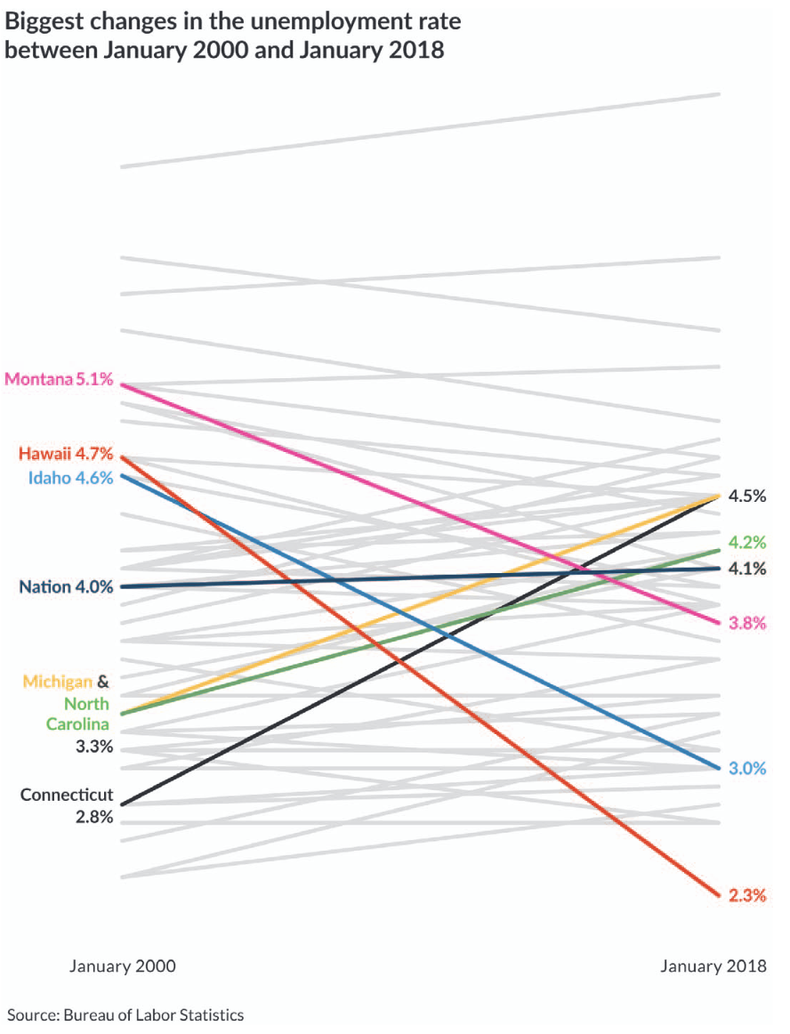
Fig. 11 A good example of pre-attentive processing used to highlight a national trend and the trends for states of note. From [Sch21], page 151.#
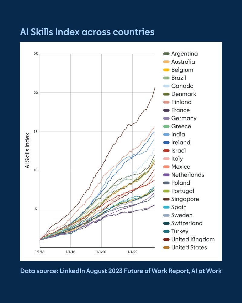
Fig. 12 A bad example from my former colleagues at LinkedIn, showing a lot of clutter and sparking no joy (source).#
In a scatter plot with many overlapping points, reduce the opacity of points to make it more clear where the majority of the data lies.
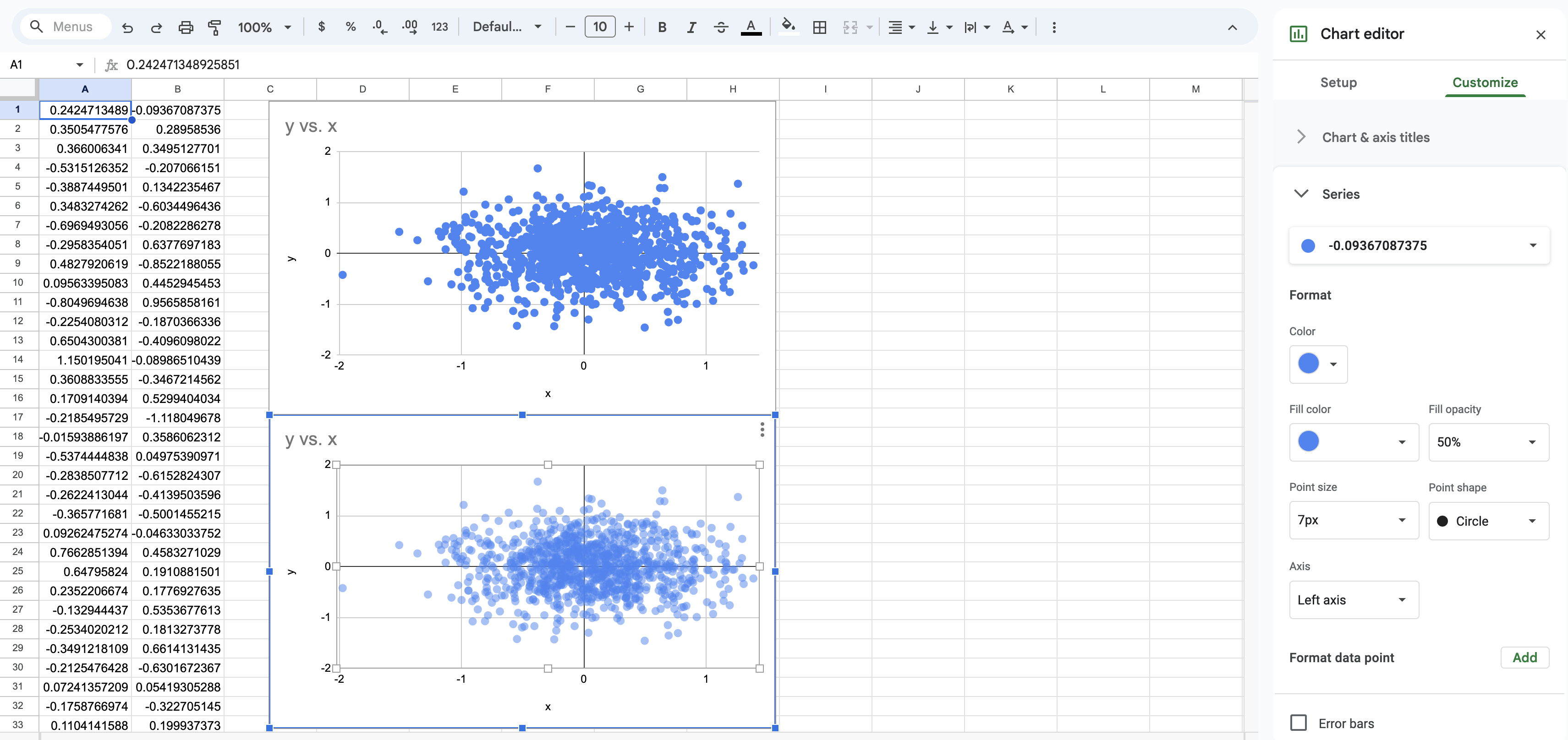
Fig. 13 In Google Sheets, use the chart editor to change the opacity of each point in a scatter plot.#
Exercises#
Exercise 12
Most artists on Spotify have uploaded fewer than 10 songs, but a small number of artists are very productive with much larger catalogs. Sketch a histogram with exactly three blocks that is consistent with this.
Exercise 13
Provide two different data sets that could produce the following histogram with a single block.

Exercise 14
Classify each of the following variables as qualitative or quantitative.
car color
number of cars owned
number of red cars owned
saturation of car color
Exercise 15
A person must be at least sixteen years old to use a Peloton treadmill, according to Peloton’s terms of service. Assume all users must enter their age before using a treadmill.
Sketch a plausible histogram for user ages if all users are honest and comply with this requirement.
A data scientist at Peloton wants to see if a large number of users who are below the age of sixteen lie and say they are sixteen. Sketch a histogram that might indicate this is happening.